Hapori - a peer-to-peer study platform
2022
Roles: User Research, UX/UI Design
Tools: Balsamiq, Figma
Client: CareerFoundry UI Project
Team: Myself (designer, researcher), Thania Soetandar (mentor)
Timeline of Two Months
Summary
The Covid-19 pandemic has changed the way people work and study, leading to students using existing tools to collaborate with peers. But switching between apps and working around tool limitations can make managing study difficult. That’s where Hapori comes in: a centralised web app to simplify remote studying.
From gathering resources to giving feedback and collaborating on projects, Hapori provides a unified tool for students to study together in any environment. While an early mockup has been created, further rounds of usability testing with students of different backgrounds and needs are necessary to ensure continued success in the ever-evolving world of remote learning.
Objective
Design a responsive web app that enables students to manage their study with peers, facilitate the sharing of resources and feedback, and provide a centralised means of communication on shared projects.
Design Process - the 5 Ws Method
What is the product? - A responsive web platform for peer-to-peer learning
Who is it for? - Students working remotely with others on shared projects and assignments
Why does it need to be created? - To help students manage their shared study on one unified, purpose-built platform, rather than having to retrofit existing products
What does it need to do? - Store study materials and resources, allow for feedback on individual work such as essay drafts, and messaging amongst students working on a shared assignment
Where and When will it be used? - Between classes, students in the same or similar course can help each other with tasks and assignments, share resources and feedback. It will also be useful for finding collaborators on projects. As a web tool built for remote study, it can be used anywhere.
“Students need a way to find peers that are working on the same tasks, assignments and courses, so that they can share resources and feedback with each other.
We will know this to be successful when students report using Hapori more compared to existing methods, such as Discord or Facebook Messenger groups.”
User Personas
A proto-persona was created to better understand the students and place them at the center of the design process.
Alex
Alex is a student enrolled in an online course who works part-time as a retail store manager.
As he juggles working with his study, Alex wants to find things like relevant supporting materials, advice from fellow students on studying efficiently, and receive peer feedback. He wants to connect with like-minded students to share his work and collaborate.

User Flows
From the above proto-persona, we can create the following three user stories to begin defining our flows:
-
As a new user, I want to create a profile, so that other students can find me.
-
As a frequent user, I want to be able to message other students, so that we can problem-solve together.
-
As a frequent user, I want to be able to view and share articles, videos, images, and other files, and write posts for other students to read, so that we can share knowledge.

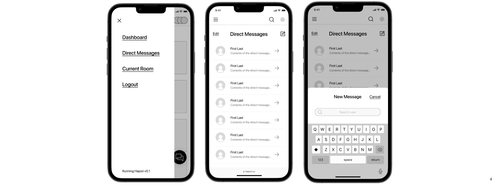
Prototypes
With user flows defined, initial designs were created as low-fidelity wireframes in Balsamiq.
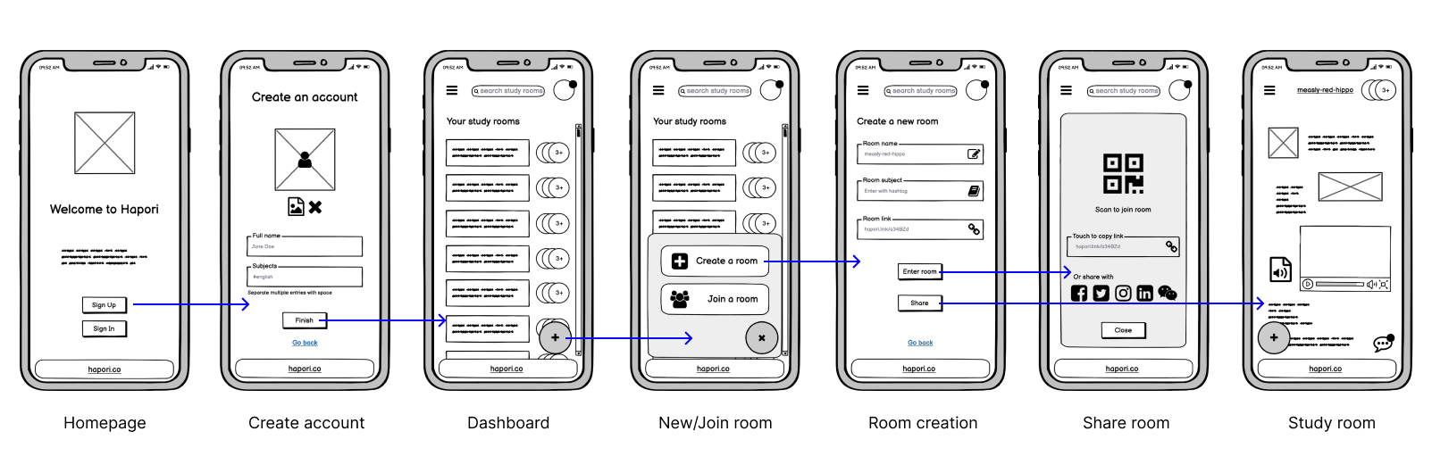
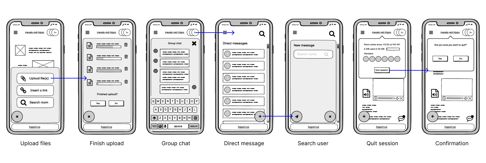
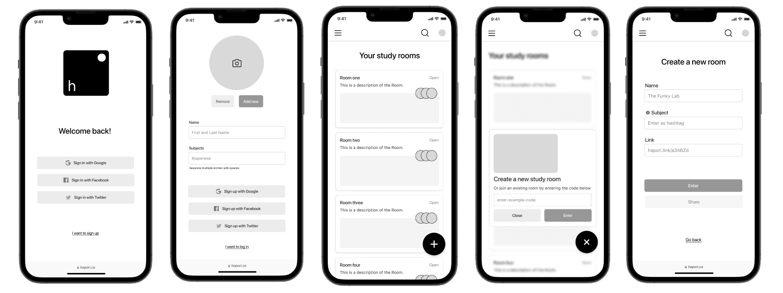
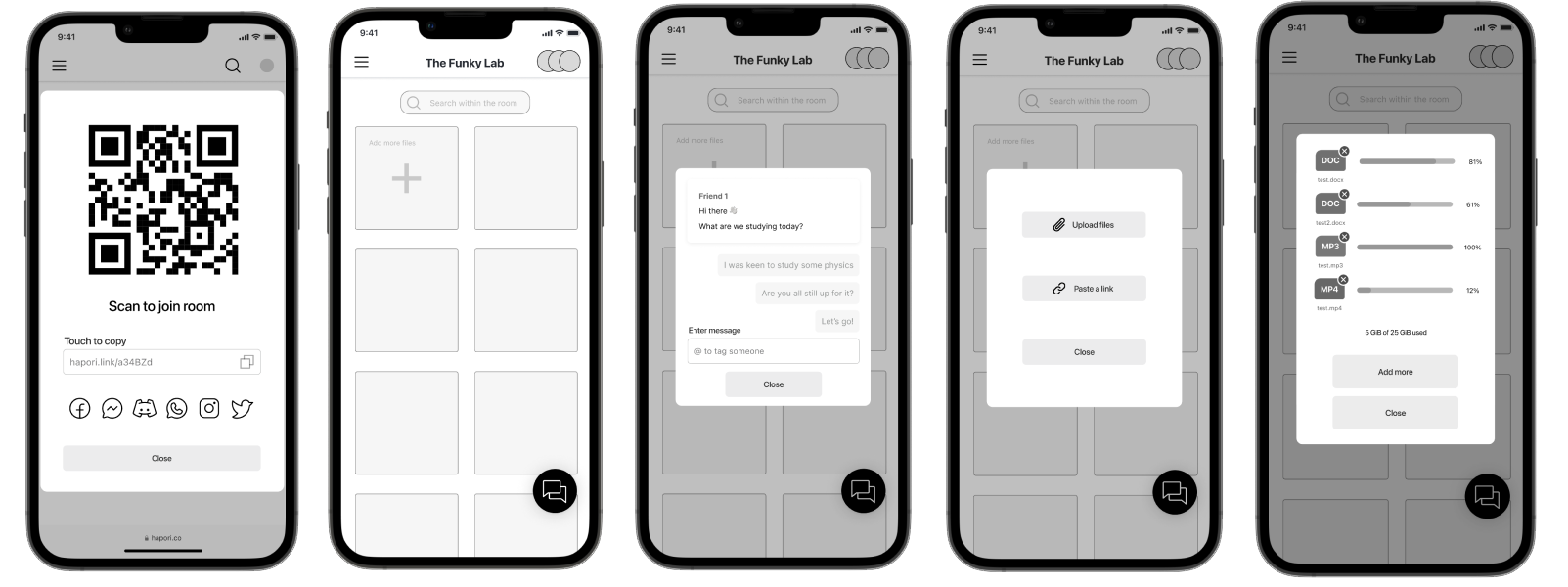
These were soon followed up by the creation of mid-fidelity wireframes in Figma.
Visual Design
In order to further define and refine the visual identity of Hapori, two moodboards were created as a starting point before a full visual language system could be established.
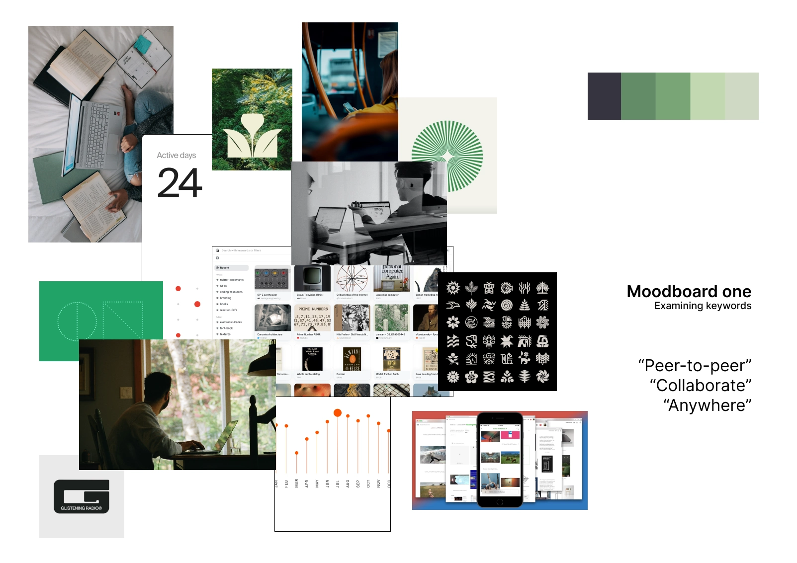
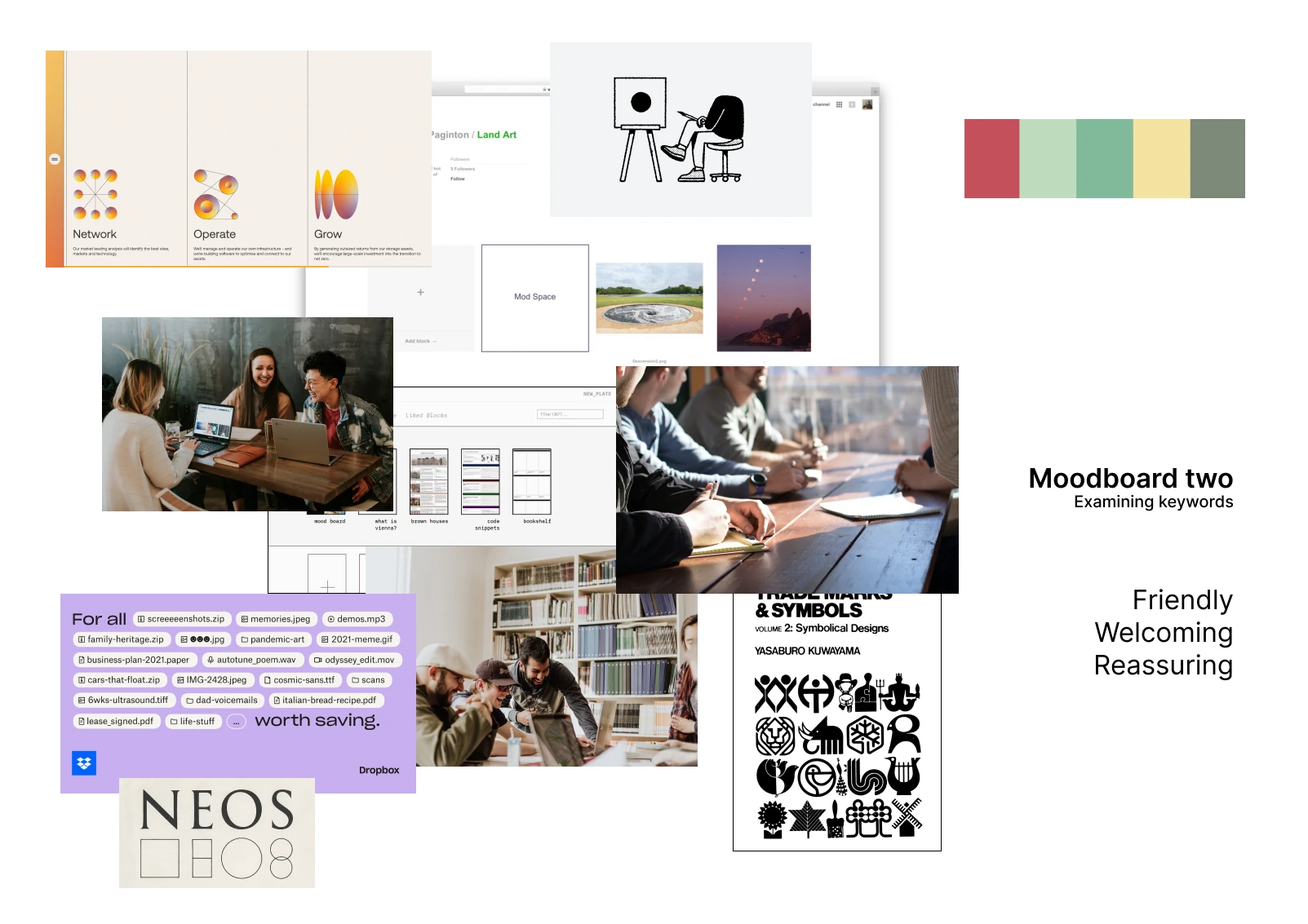
After re-examining the key requirements of Hapori, moodboard one was chosen as it has the potential to give friendly, welcoming and reassuring feelings and hold a unifying green palette as the core colour without sacrificing usability in the process. Using colour as accents to enhance communication, rather than as mere decoration, was identified as an important point of focus for Hapori.
An initial visual design guide for Hapori was then developed and released. The guide establishes a set of design principles, patterns, and UI components that will be used to create consistent experiences across all breakpoints and future iterations.
View the guide here
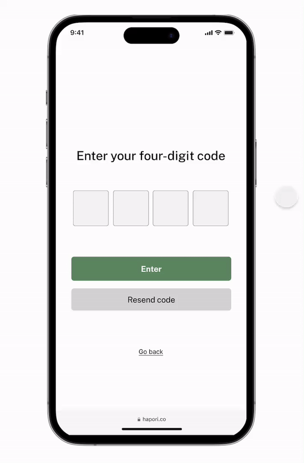
Hi-fidelity Prototype + Animations
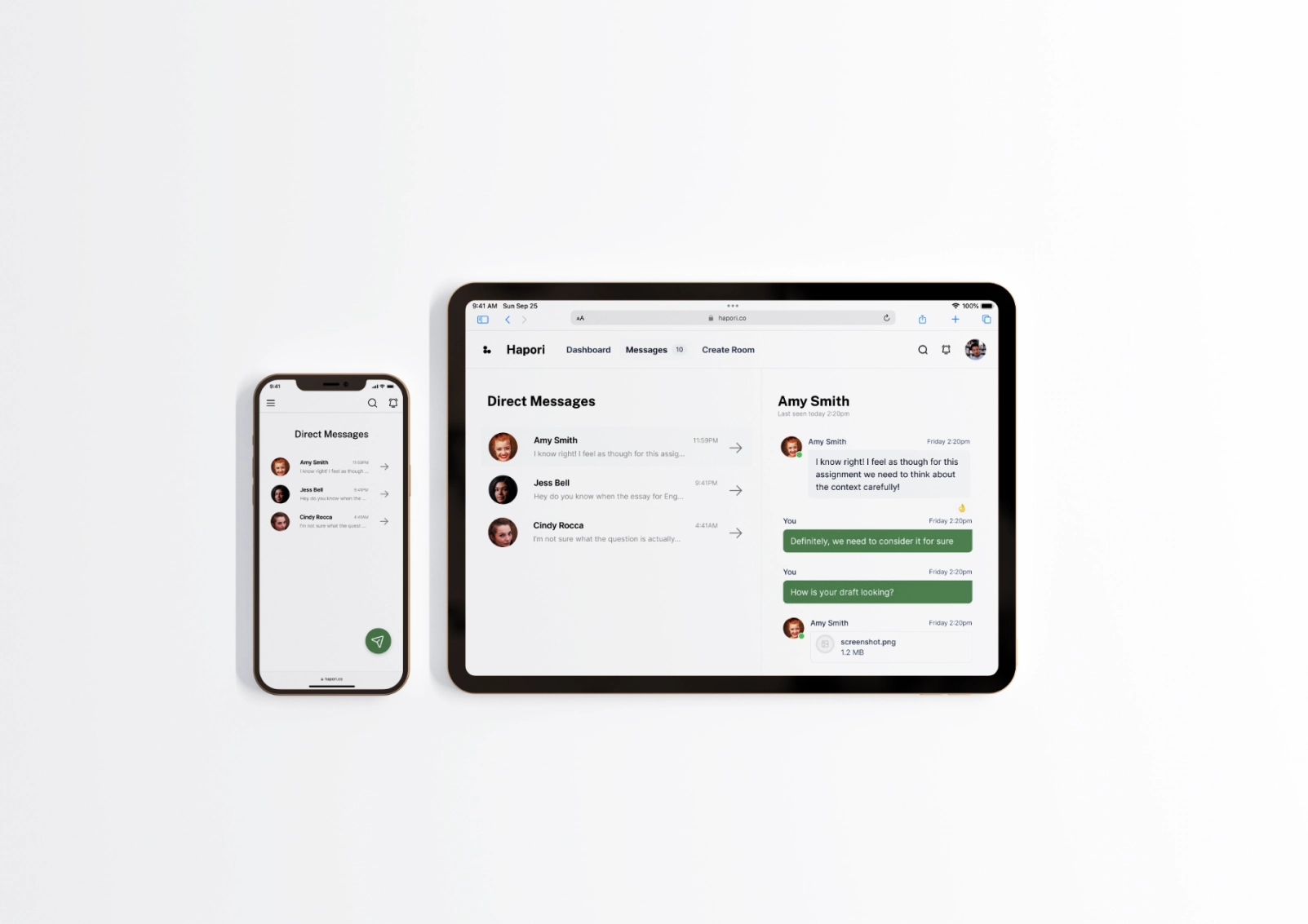
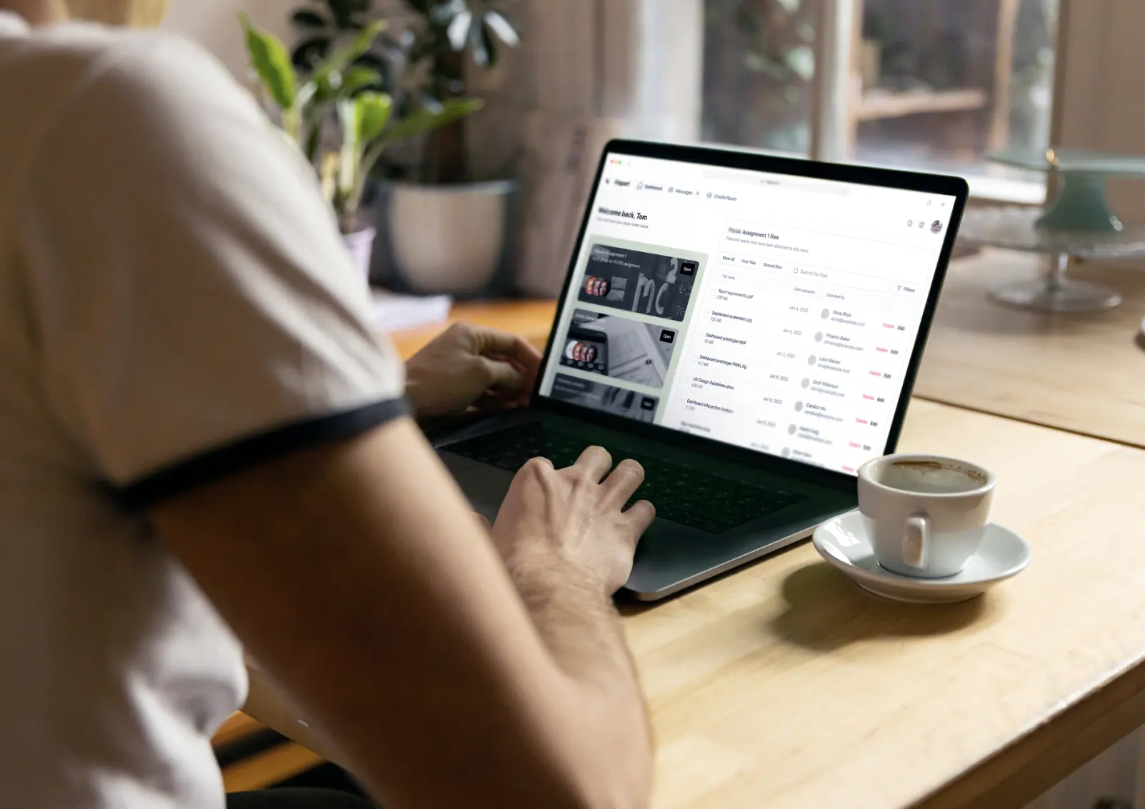
After finishing the mobile design, we started designing Hapori’s content for other breakpoints so that it can respond effectively based on different screen sizes and devices. Subtle hover animations were also added to further enhance user interactions for buttons and other input methods across the platform.
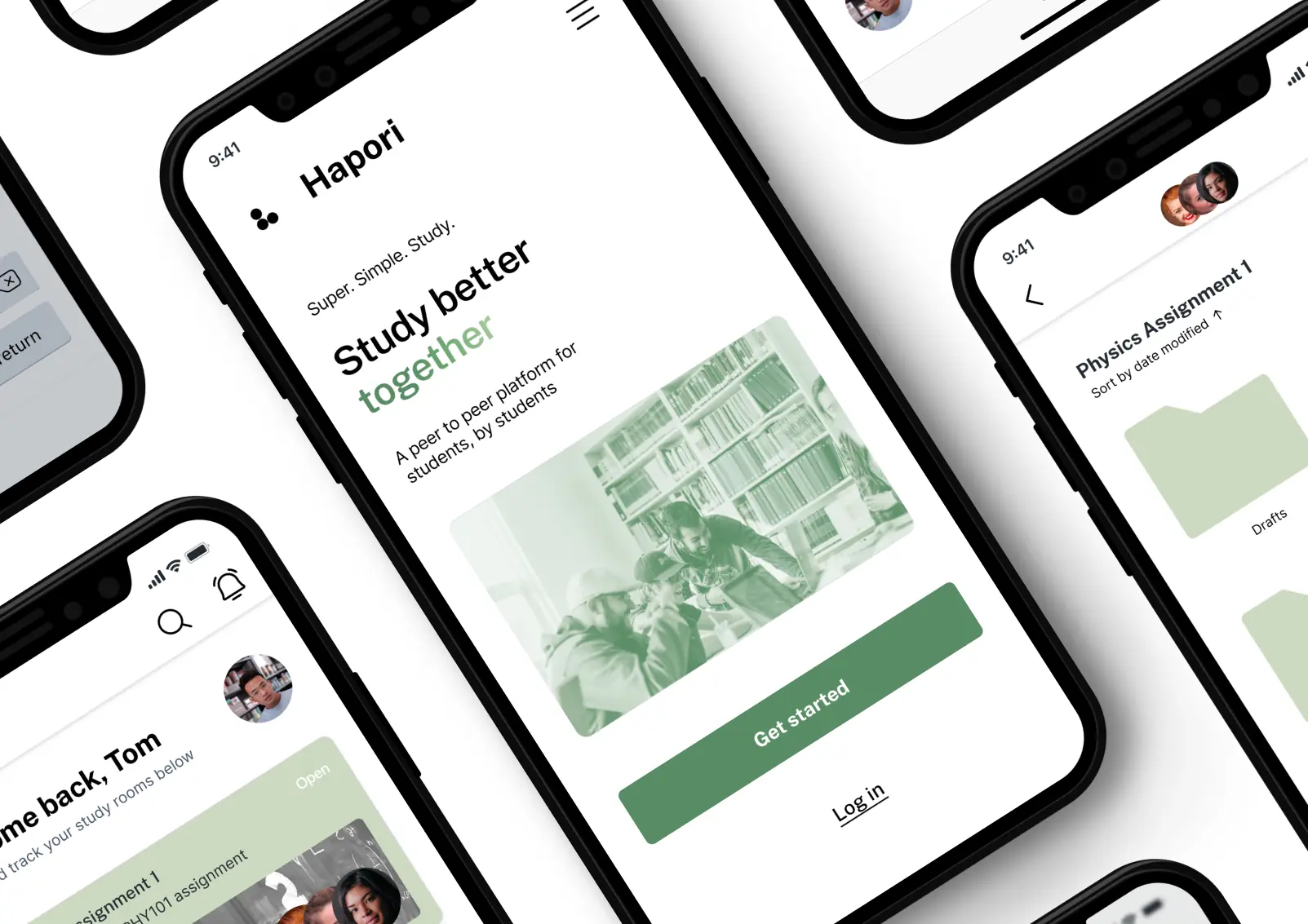
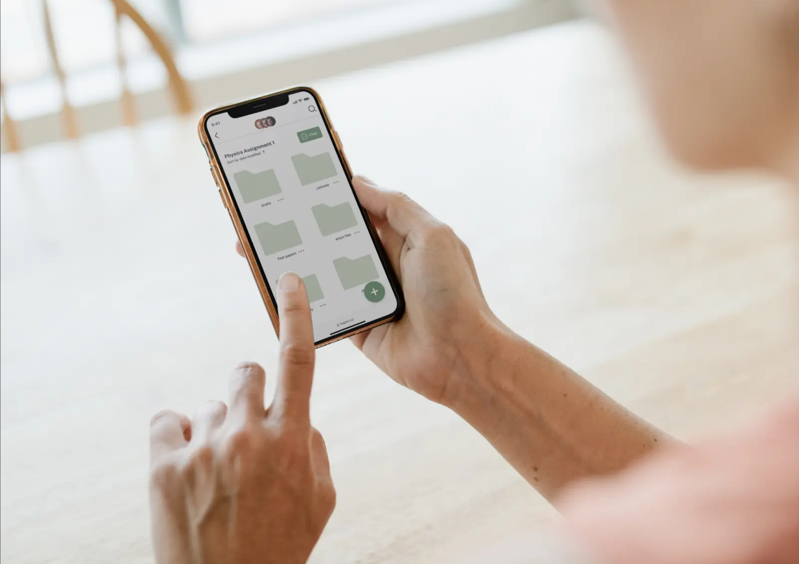
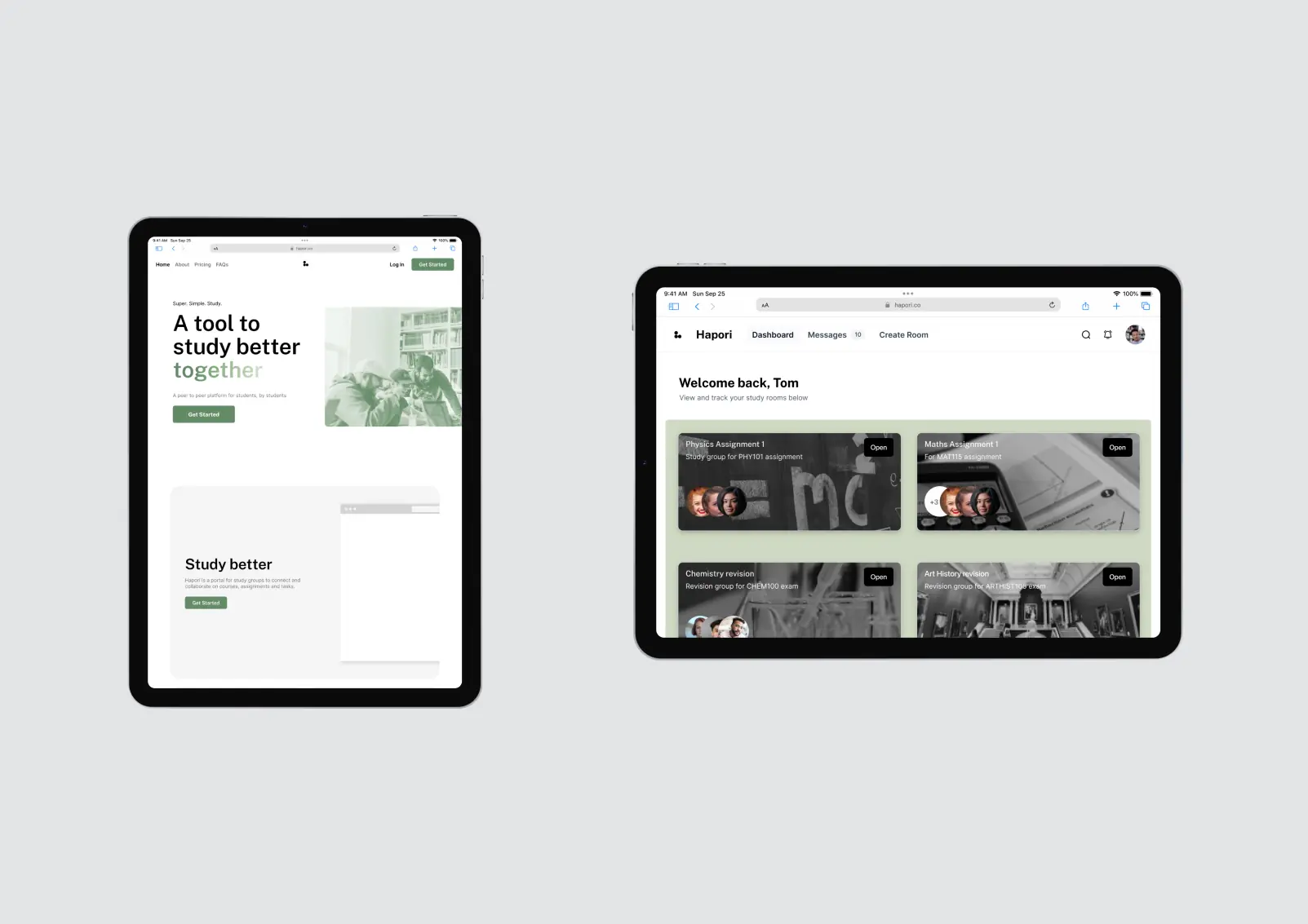
Polished Mockups
The hi-fidelity prototype was then put into different contexts through a series of mockups, illustrating different screens and breakpoints in action.
Reflections + Next Steps
Key takeaways:
- Creating a visual design system ensured consistency across screens and breakpoints.
- Utilising common design patterns improved usability and sped up design and development.
- Moodboards helped contextualize the app’s look and feel.
Challenge:
The biggest challenge was the lack of user testing and usability research. While we followed universal design patterns and guidelines, user testing could have helped us meet our target audience’s needs better.
Next steps:
We need to conduct usability testing to validate our designs and identify any pain points. We also need to design more screens to expand Hapori’s functionality.